schlaegerbespannung.at
Sometimes the brief is clear, the brand is set, and the job is simply to make it shine. Schläger Bespannung needed a website that matched the energy of their new corporate identity — sharp, sporty, and straight to the point.

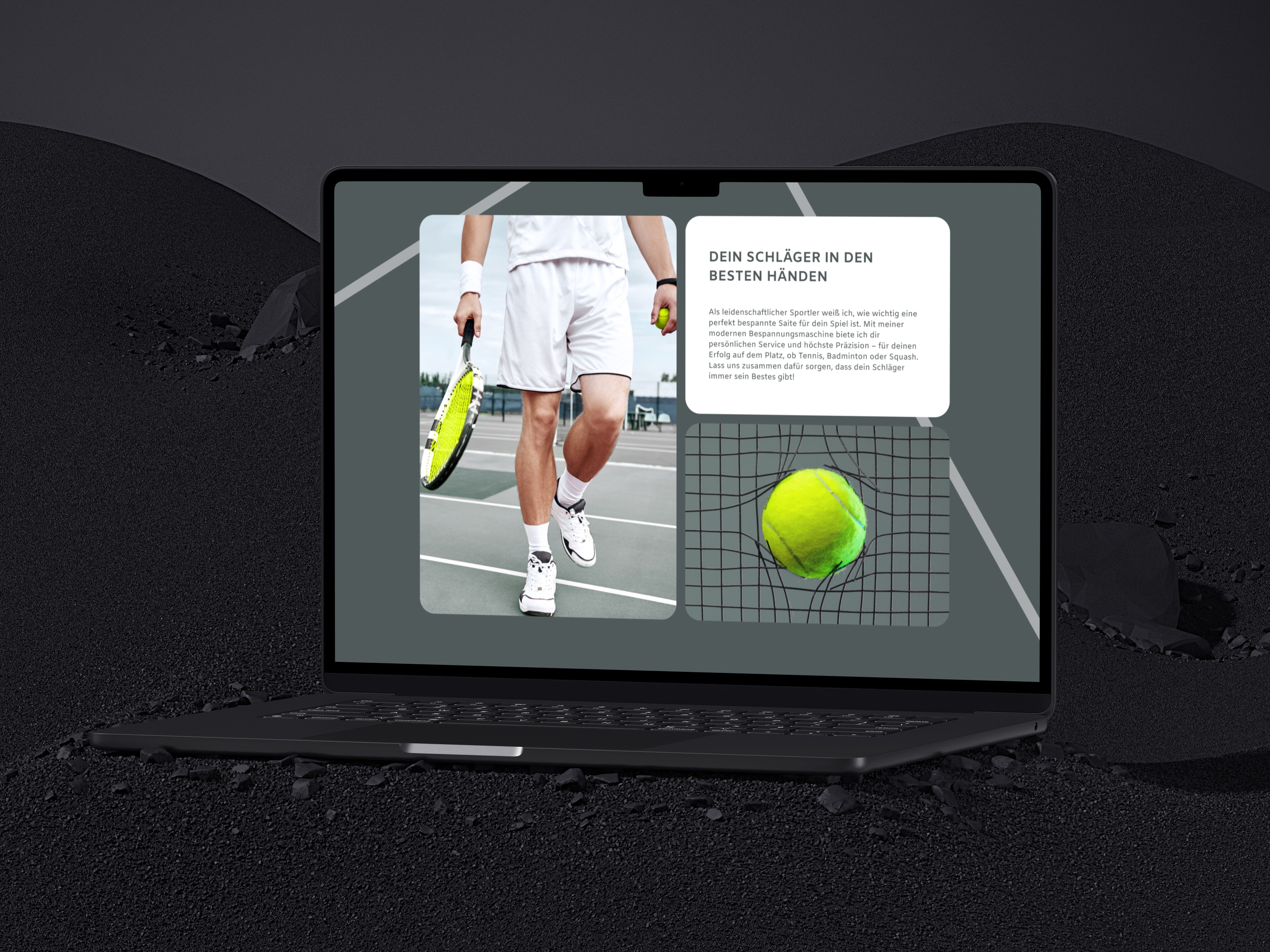
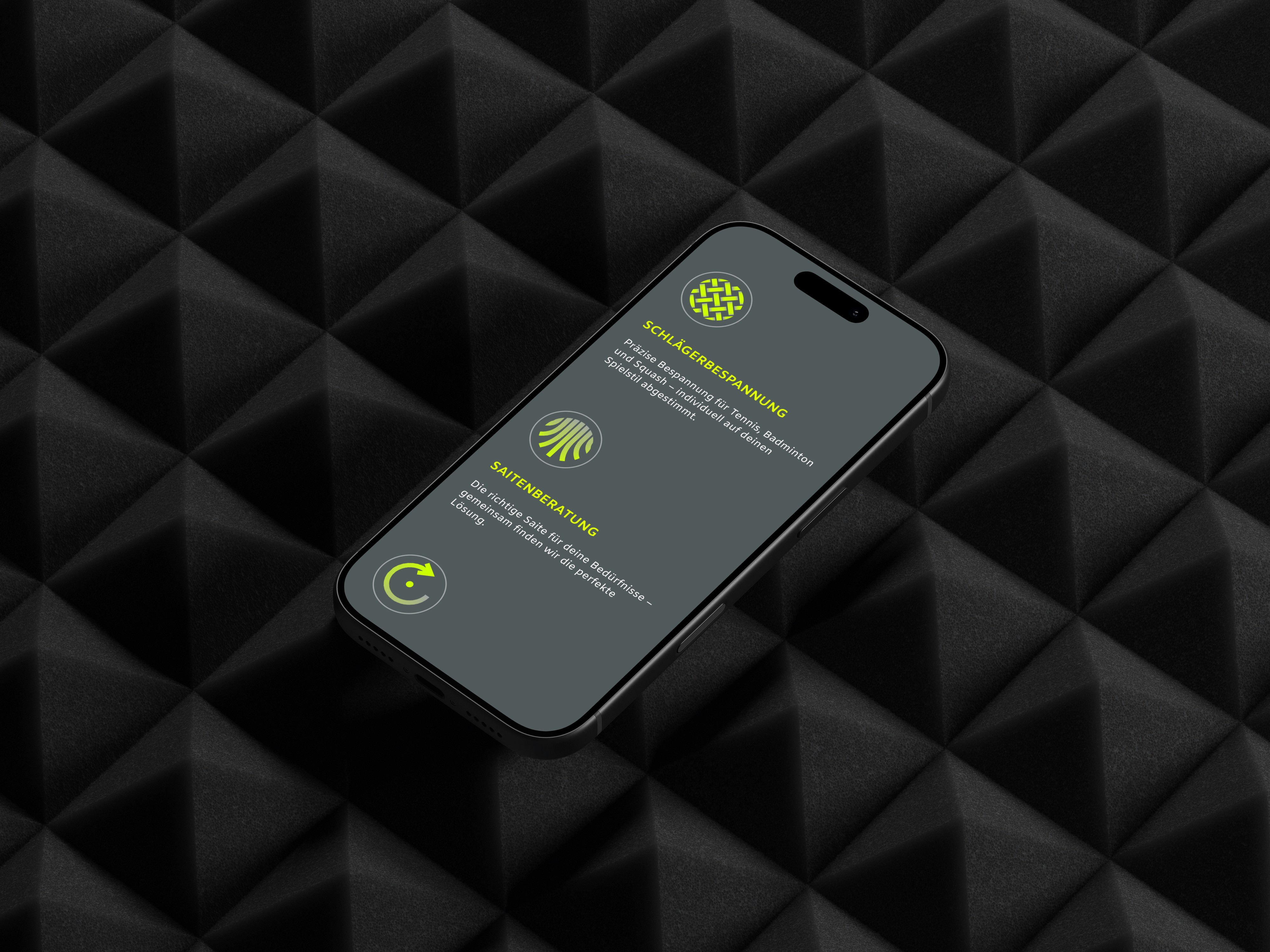
/// Schläger Bespannung is an Austrian racket stringing service for tennis, badminton, and squash players. With a freshly redesigned brand identity already in place, the goal was to translate that new look into a clean, conversion-focused one-pager — one that communicates the service, the pricing, and the personality of the business at a glance.
/// The existing web presence didn't reflect the new brand direction. A modern, high-energy corporate identity had been developed — but without a website to match, the first impression the business made online was falling flat. The design needed to close that gap and give the brand a digital home that felt as confident as the identity itself.

/// A bold, focused website built around the new CD — dark backgrounds, high-contrast neon green accents, and a clear content hierarchy that guides visitors from services and pricing straight to the contact form. Clean, fast, no friction.
+67%
Contact Form Submission Rate
-38%
Bounce Rate
+50%
Time on Page
/// With concept and UX already defined by the project scope, the focus here was entirely on screen design — translating the new corporate identity into a polished, responsive layout in Figma. Every design decision served the CD: typography, spacing, colour application, and visual rhythm were all built to reflect the brand's energy while keeping the user path simple and direct.

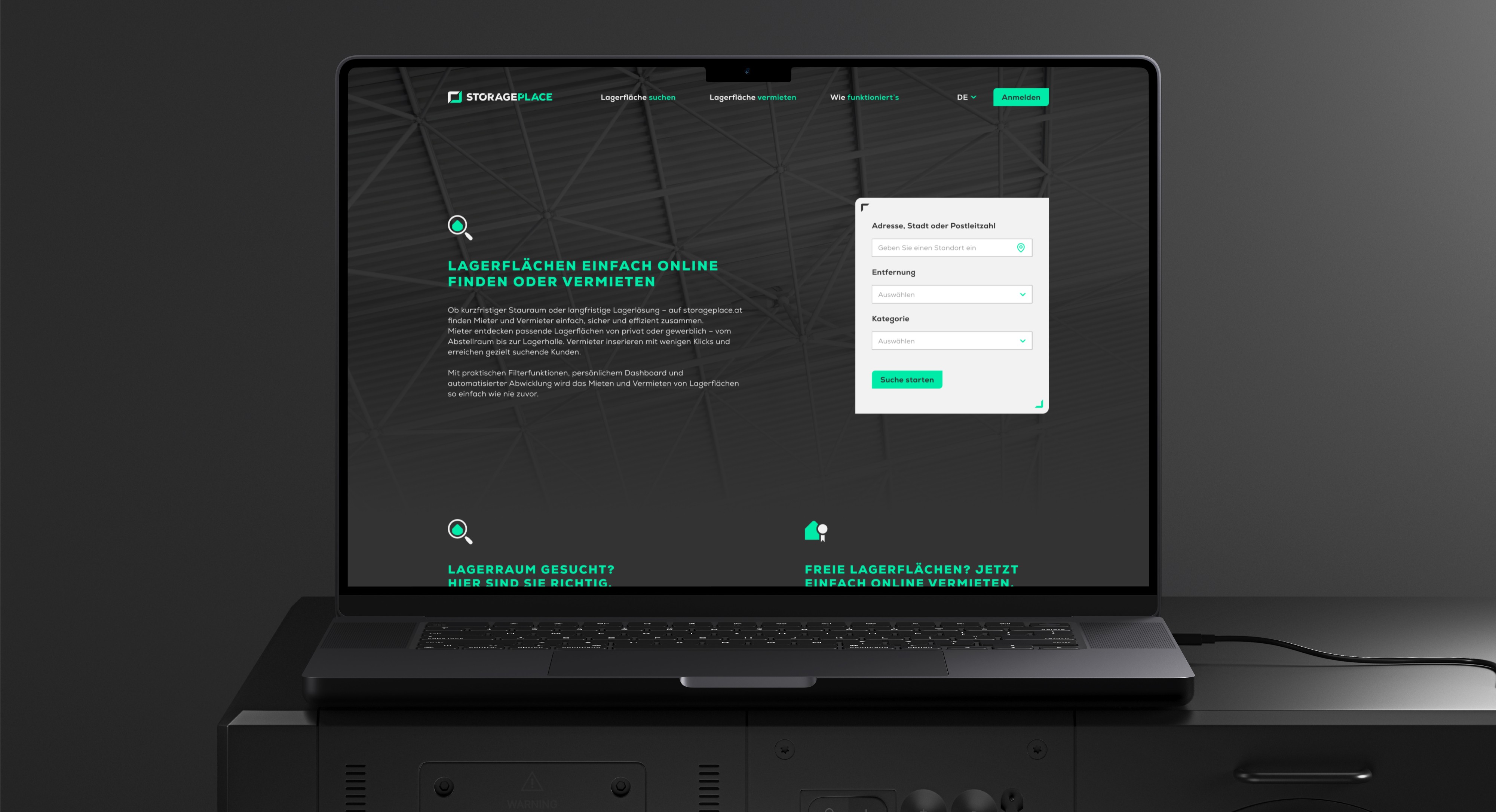
STORAGEPLACE
///UX UI CONCEPT Two-sided marketplace for storage spaces — designed for renters and landlords simultaneously, from research to developer handoff.
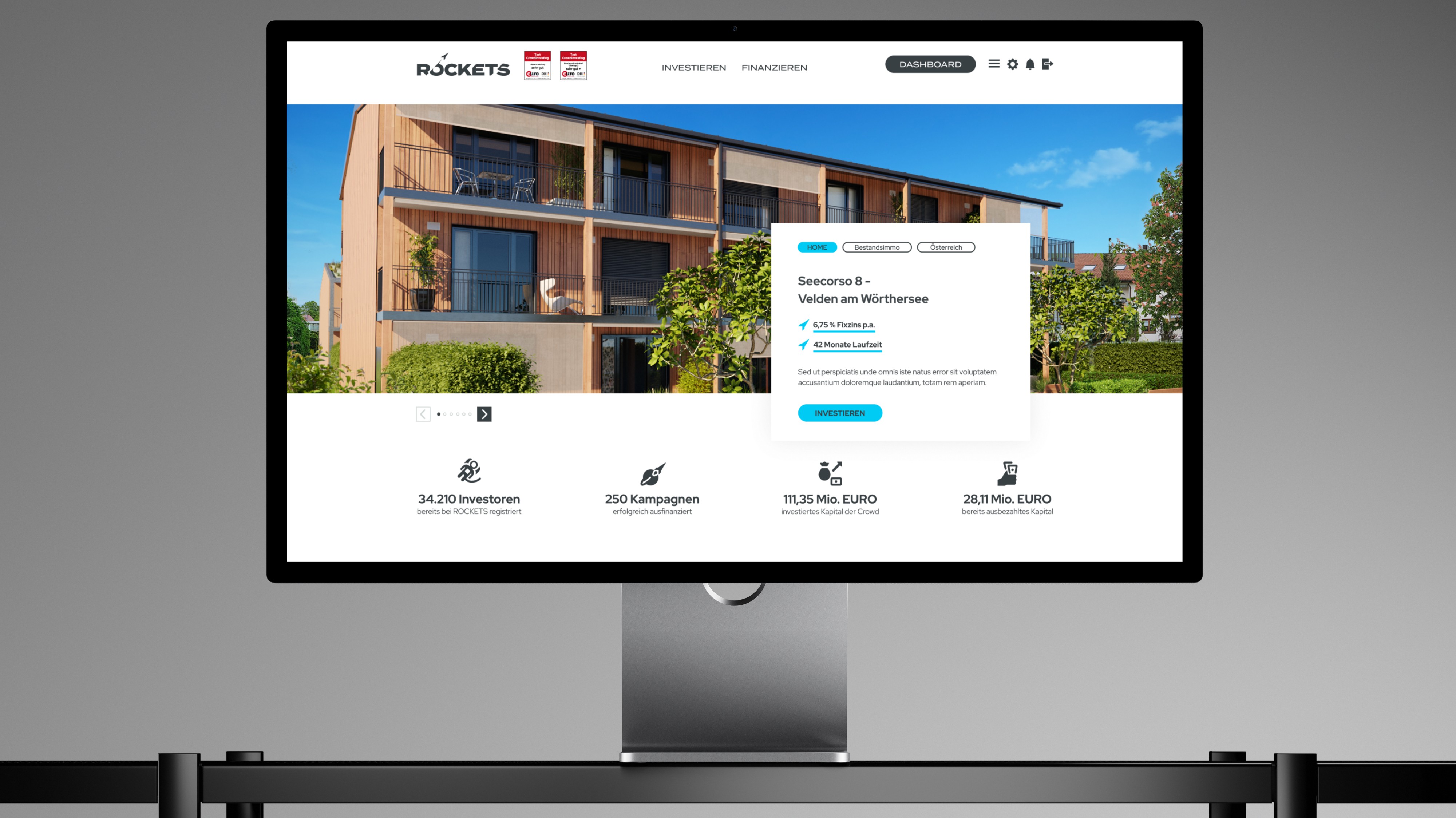
ROCKETS Investments
///UX UI CONCEPT Merging three crowdinvesting brands into one unified platform — without losing trust, identity, or a single existing user along the way.