LIGNUM
How do you make someone feel the grain of solid oak through a screen? LIGNUM builds furniture that lasts generations — but their website didn't reflect that same level of craft. The redesign shifts the digital presence from online catalogue to editorial showroom, letting the material and the story do the talking.

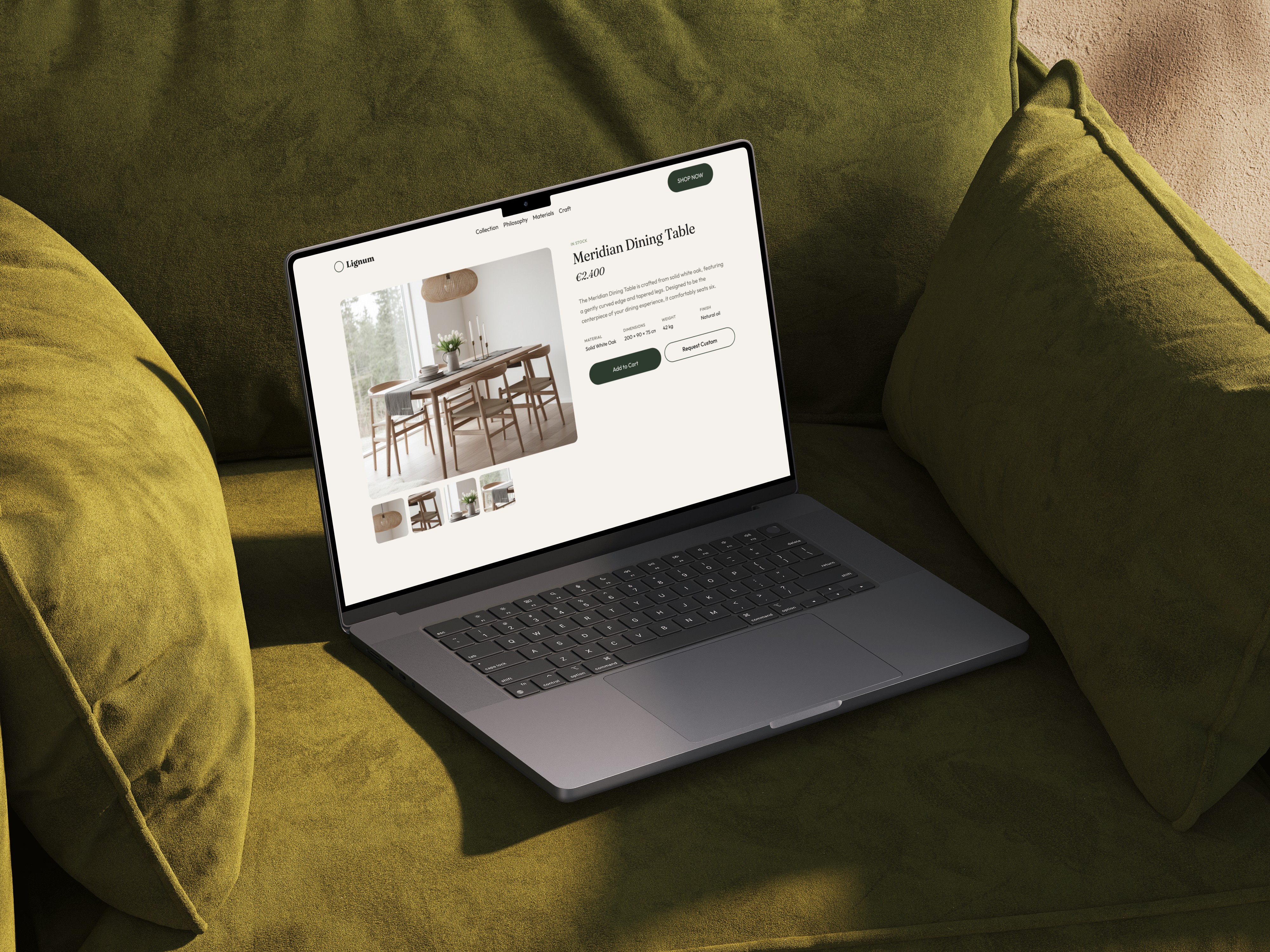
/// LIGNUM is a Scandinavian manufactory specialising in handcrafted wooden furniture — pieces built to last generations, where every joint and grain tells a story. The website redesign was driven by the need to translate the tactile, material quality of the product into a digital experience that feels equally intentional. The goal: a brand presence that reflects the same design philosophy as the furniture itself — reduced, honest, and warm.
/// The existing website didn't match the quality of the product. While the furniture embodies precision and craftsmanship, the digital presence felt generic and catalogue-like — heavy on product listings, light on storytelling and atmosphere. Users couldn't feel the material, the process, or the philosophy behind the brand. The mobile experience was an afterthought, and the visual language lacked the editorial confidence needed to position LIGNUM in the premium segment. The challenge was to move from "online shop" to "digital showroom" — making craftsmanship tangible through screen.

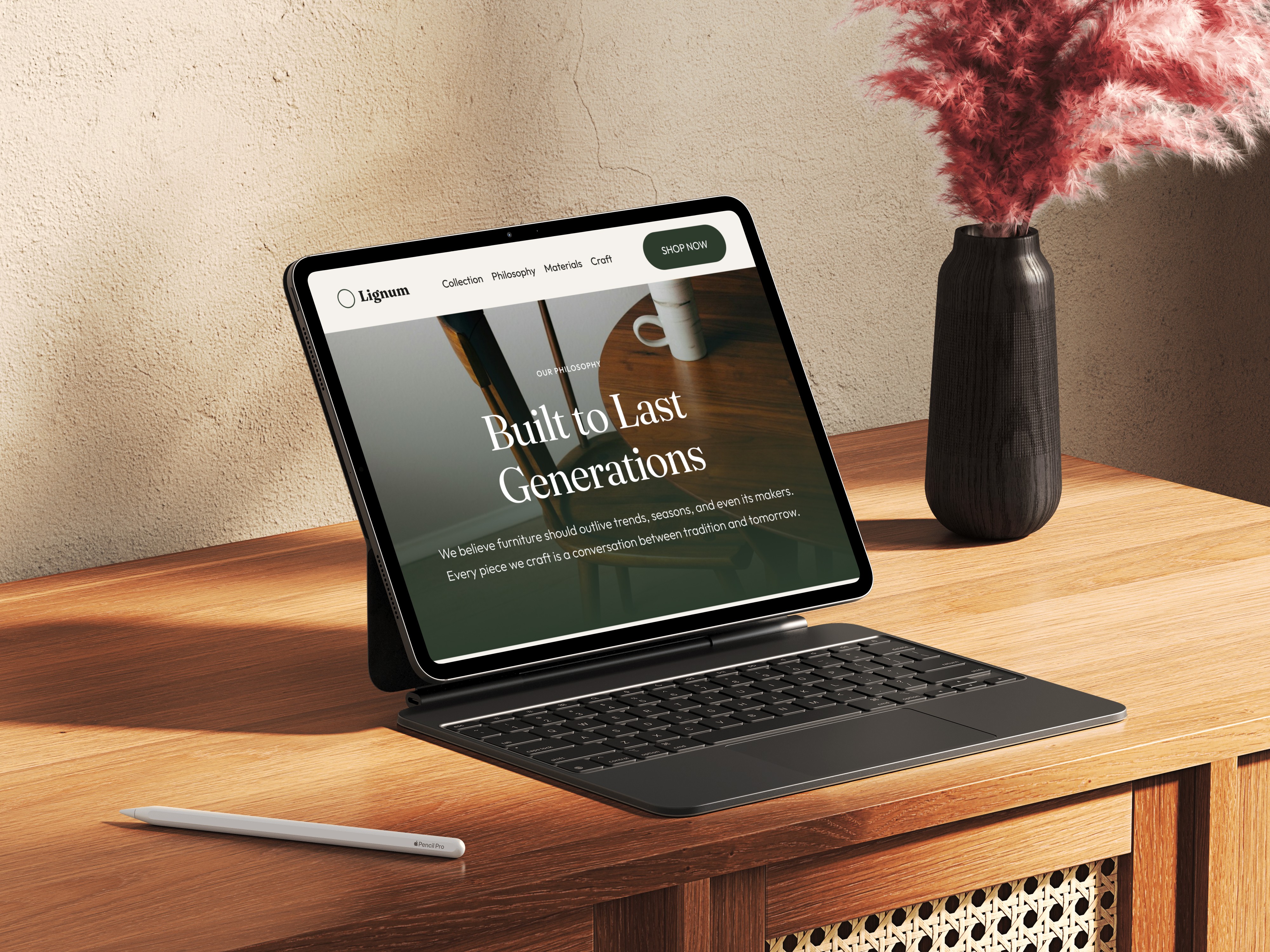
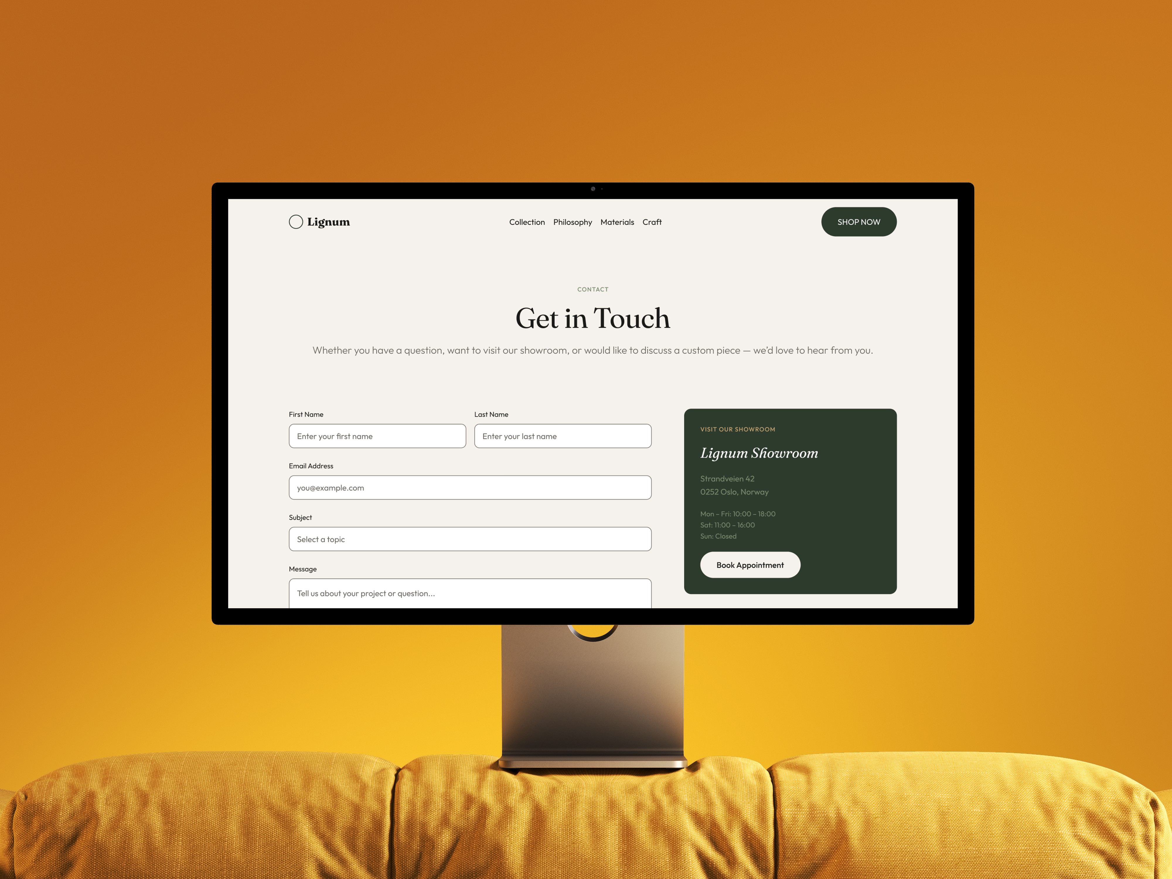
/// A redesigned website that leads with materiality and narrative. Large-format photography places grain textures, workshop details, and finished pieces centre stage. The navigation follows a storytelling structure — from philosophy and craft process to collection and contact — rather than a traditional product-first hierarchy. Generous white space, warm natural tones, and restrained typography mirror the Scandinavian design ethos. Every page breathes, letting the furniture speak for itself.
+45%
Time on Site (projected)
+28%
Product Page Engagement (projected)
+19%
Enquiry Conversation (projected)
/// The project began with a brand audit and competitive analysis across premium furniture and interior brands to identify where LIGNUM could differentiate digitally. User expectations were mapped through desk research and reference analysis of Scandinavian design-driven e-commerce experiences.
/// The information architecture was restructured to prioritise narrative flow over catalogue logic — leading visitors through the brand's philosophy, materials, and craftsmanship before arriving at individual product pages. Wireframes were developed and iterated to test this storytelling-first approach.
/// All design work was done in Figma, with a focus on a clean, scalable component system and responsive layouts. The visual direction centres on natural warmth — muted earth tones, organic photography, and a type system that balances editorial presence with readability. The result is a digital experience that honours the analogue craft behind every piece.

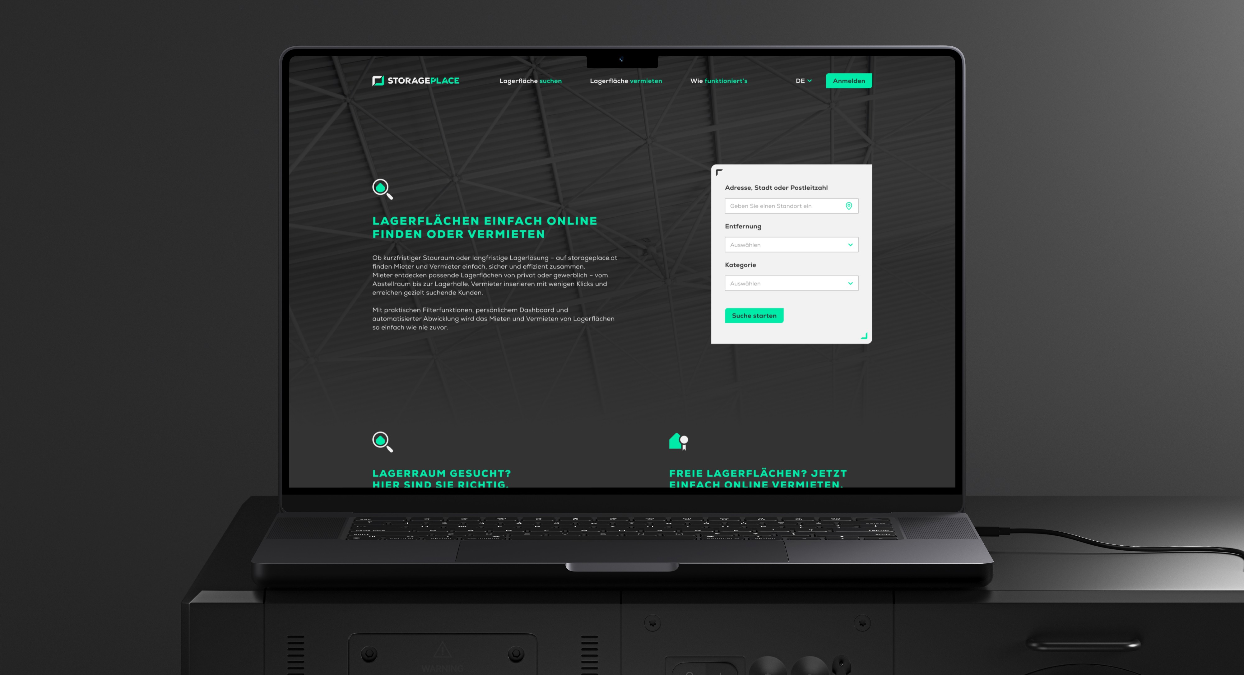
STORAGEPLACE
///UX UI CONCEPT Two-sided marketplace for storage spaces — designed for renters and landlords simultaneously, from research to developer handoff.
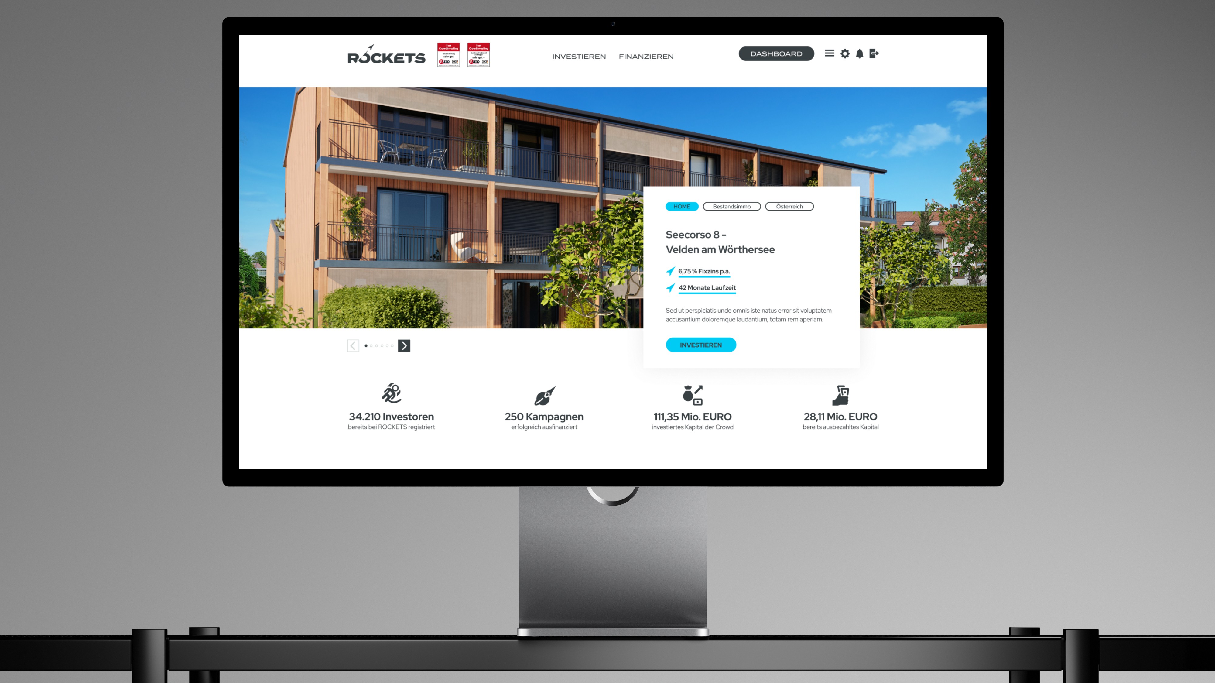
ROCKETS Investments
///UX UI CONCEPT Merging three crowdinvesting brands into one unified platform — without losing trust, identity, or a single existing user along the way.