KOJI
What does it take to translate a two-culture fine dining experience into a website that feels just as curated as the food? KOJI merges Japanese precision with Korean warmth — the redesign had to do the same, digitally. From user research to a post-launch KPI framework, this project covers the full UX journey.

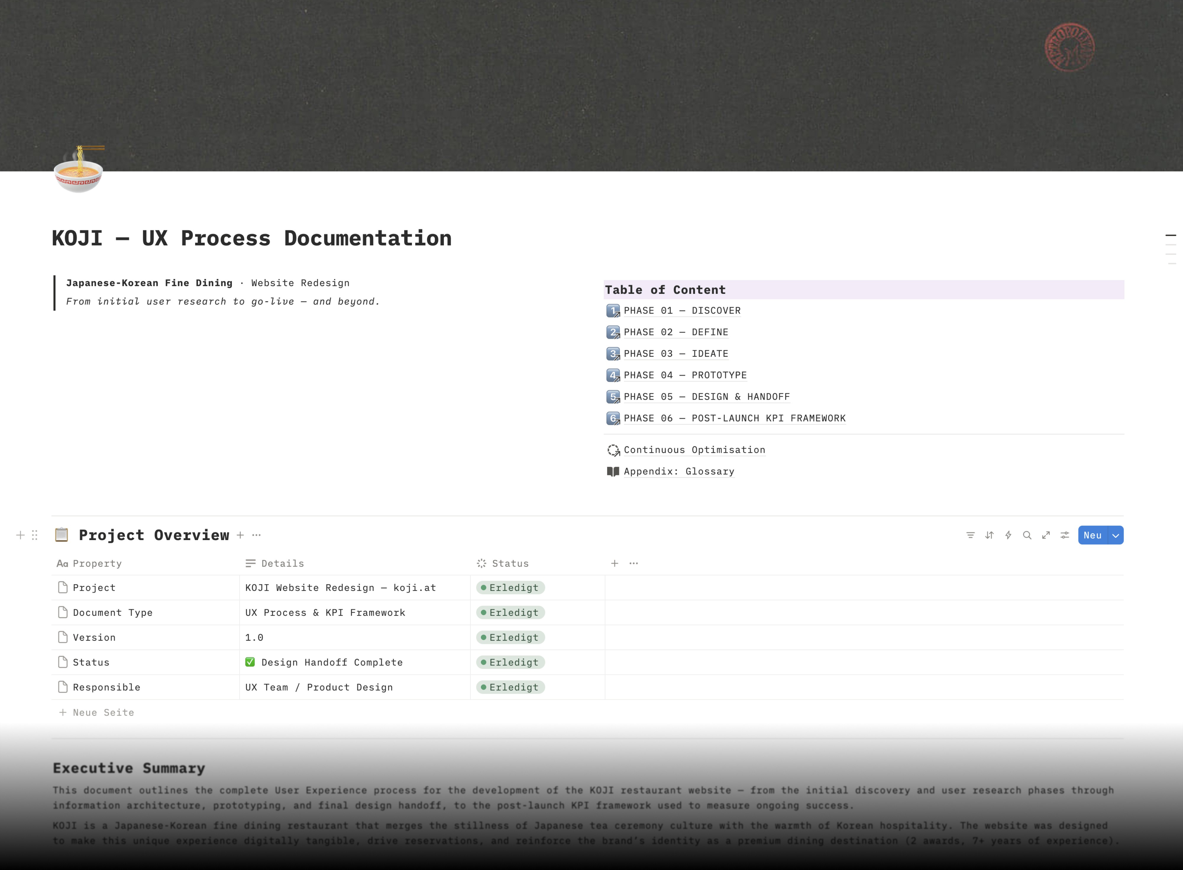
/// KOJI is a Japanese-Korean fine dining restaurant that merges the stillness of Japanese tea ceremony culture with the warmth of Korean hospitality. The website was designed to make this unique dining experience digitally tangible — driving reservations, reinforcing the brand's premium identity, and bridging the gap between a curated culinary world and the expectations of modern diners. The project followed a full end-to-end UX process: from stakeholder interviews and user research through personas, information architecture, prototyping, usability testing, and design system delivery.
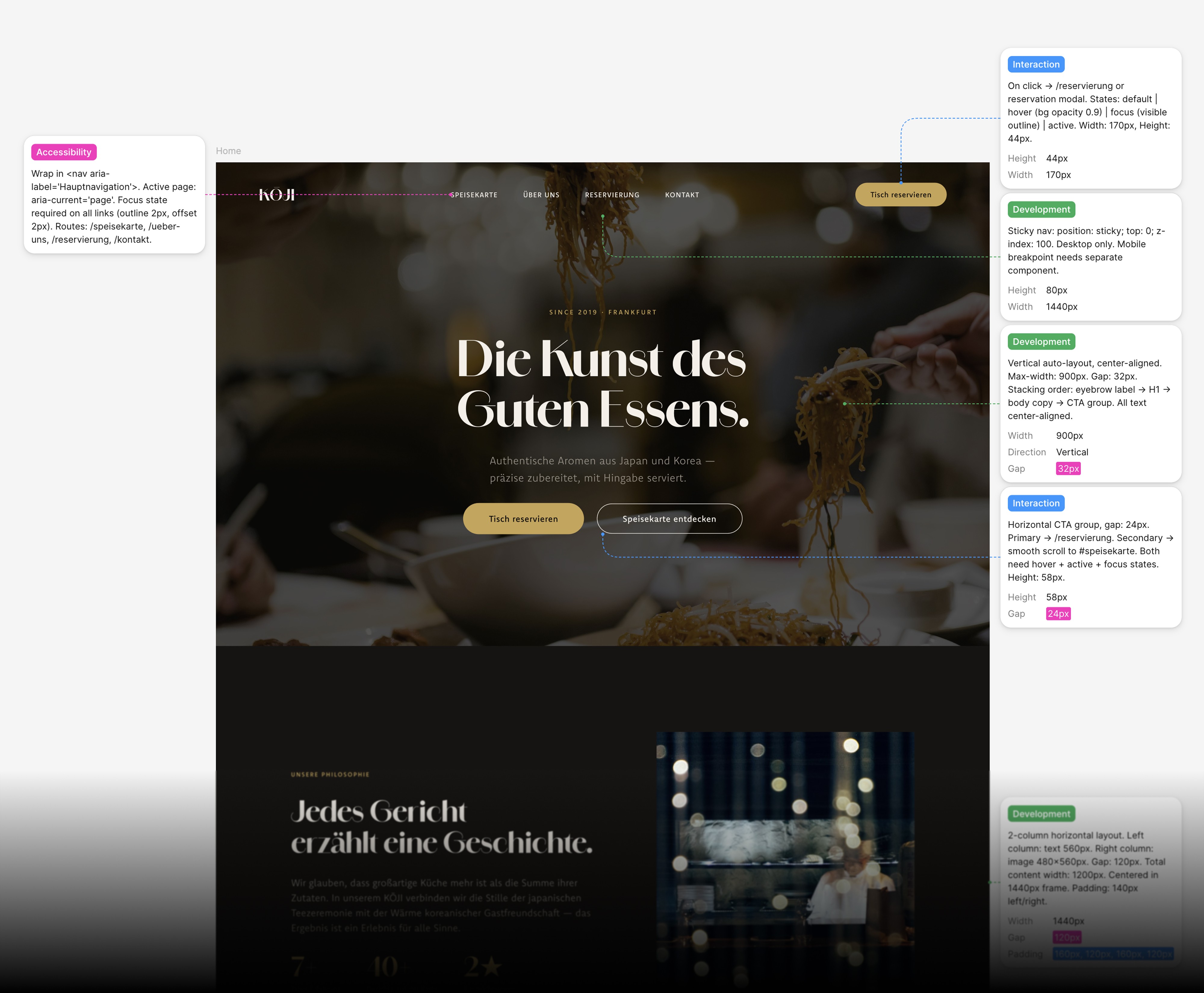
/// Fine dining websites face a paradox: they need to communicate luxury and exclusivity without creating distance. KOJI's existing online presence was not mobile-optimised — a critical issue given that 68% of the target audience browses restaurant websites on their smartphone. On top of that, 42% of users abandon a reservation process if it requires more than three clicks, and 76% consider a menu preview essential before visiting a new restaurant. The challenge was to create an experience that feels as considered as the food itself — atmospheric, effortless, and designed around how guests actually discover, evaluate, and book fine dining.

/// A reservation-first website built on a clear information architecture, where atmospheric photography and storytelling do the heavy lifting. The booking flow was reduced to a maximum of two clicks from any page. A fully responsive design system — dark backgrounds, warm gold accents, and a serif-sans typography pairing — creates a premium yet approachable feel. The menu section includes allergen transparency and the story behind each course, addressing the two most common pre-visit questions identified in research.
+34%
Reservation Conversion (projected)
-52%
Booking Abandonment (projected)
+61%
Mobile Session Duration (projected)
The complete UX process documentation — from research findings through personas, journey maps, and the KPI framework — is publicly available on Notion:
/// This was a full end-to-end UX project — from discovery workshops with five stakeholder groups (owner, head chef, service manager, reservations manager, marketing) through three research methods: an online survey, contextual observation, and competitor benchmarking across 11 fine dining websites including Noma, Eleven Madison Park, and Atera.
/// Three personas were developed to guide design decisions, alongside a detailed user journey map and a set of "How Might We" questions that framed the ideation phase. A two-day design sprint produced the information architecture and a MoSCoW-prioritised feature set. The design moved through two rounds of usability testing — lo-fi wireframes with 8 participants, mid-fi with 6 — before reaching the final high-fidelity stage.

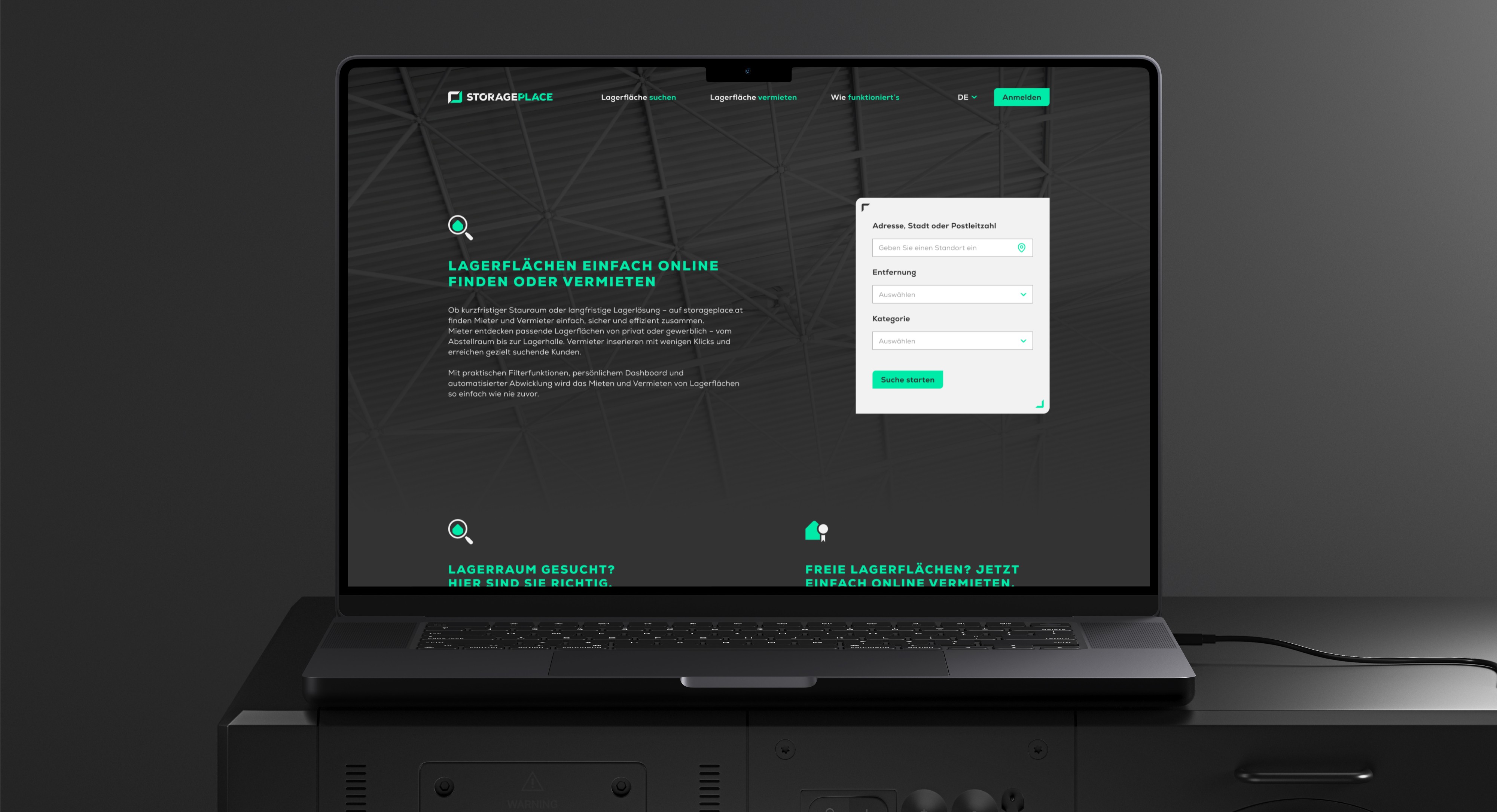
STORAGEPLACE
///UX UI CONCEPT Two-sided marketplace for storage spaces — designed for renters and landlords simultaneously, from research to developer handoff.
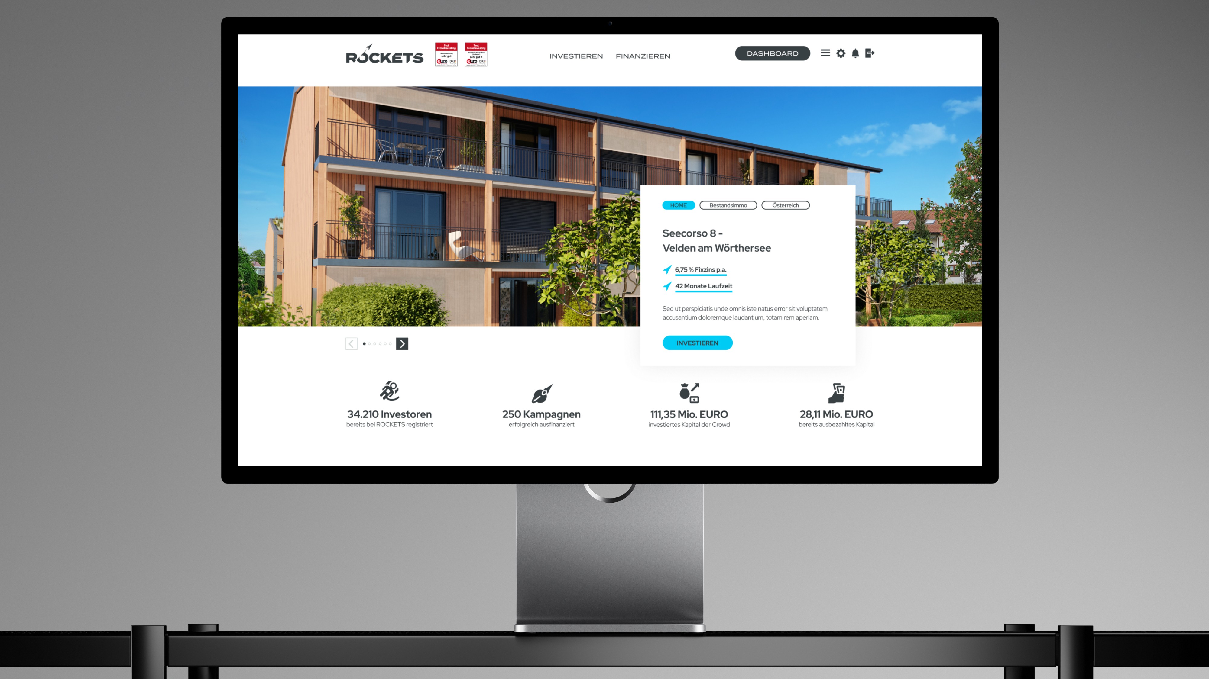
ROCKETS Investments
///UX UI CONCEPT Merging three crowdinvesting brands into one unified platform — without losing trust, identity, or a single existing user along the way.