IMPEX Website
What does a sanitary and heating wholesaler actually need from a website — when their customers range from professional installers to homeowners planning a dream bathroom, and job seekers looking for their next career move? That was the core question behind the IMPEX redesign: one website, three very different audiences, and zero room for confusion.
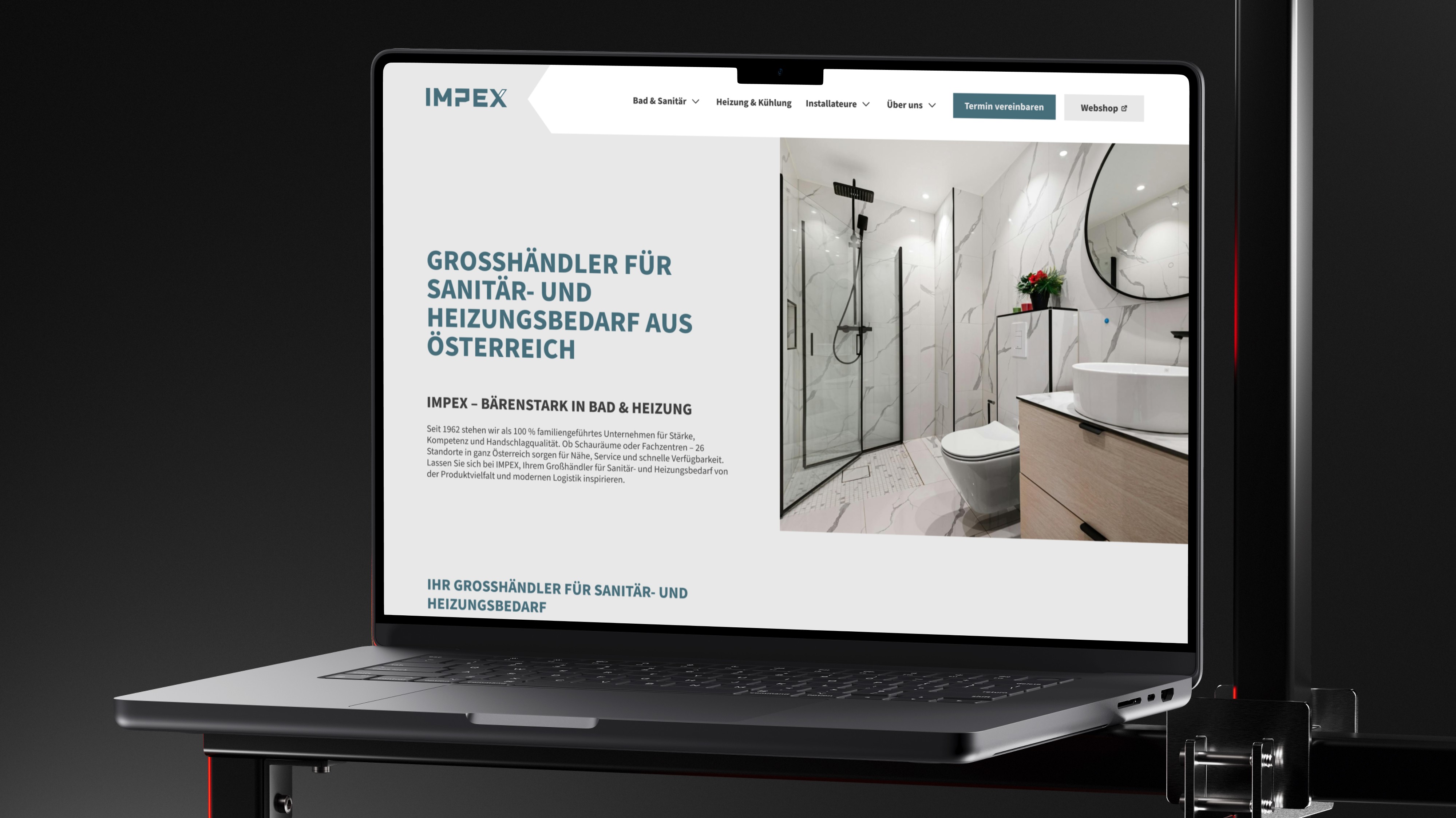
/// IMPEX is one of Austria's leading wholesalers for sanitary and heating products, with over 26 locations nationwide and a history going back to 1962. The redesign wasn't just a visual refresh — it was a full structural rethink of how a B2B-first company communicates with multiple audiences online, built on a freshly redesigned corporate identity.
/// The existing website was outdated, lacked any meaningful UX structure, and had no accessibility considerations in place. On top of that, IMPEX serves fundamentally different user groups — professional installers, private homeowners, and potential employees — each with completely different needs, goals, and expectations. Creating a website that speaks clearly to all three, without feeling generic or overwhelming, was the real design challenge.

/// A multi-audience website built around three clearly defined user personas — developed through in-depth journey mapping — each with their own dedicated entry points and content paths. The information architecture, sitemap, and URL structure were designed to give every user group a frictionless path to what they need, whether that's booking an appointment, browsing products, or applying for a job.
+44%
Appointment Booking Rate
+60%
Organic Traffic Growth
+37%
Installer Portal Engagement


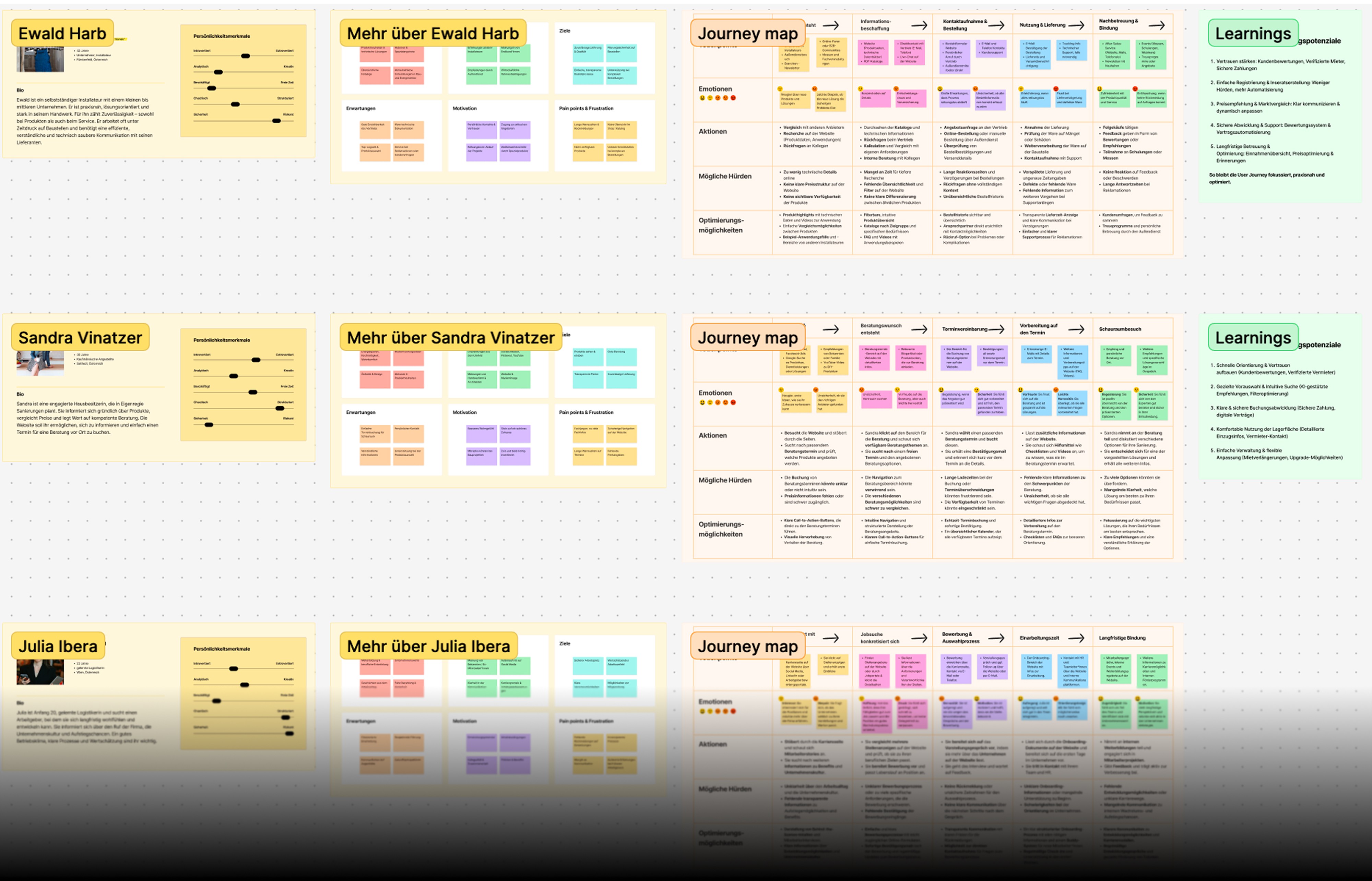
/// The project started with a deep UX foundation: three detailed user personas — a self-employed installer, a private homeowner, and a job seeker — each with their own journey map, pain points, and optimization opportunities. This research directly informed every structural and design decision that followed.
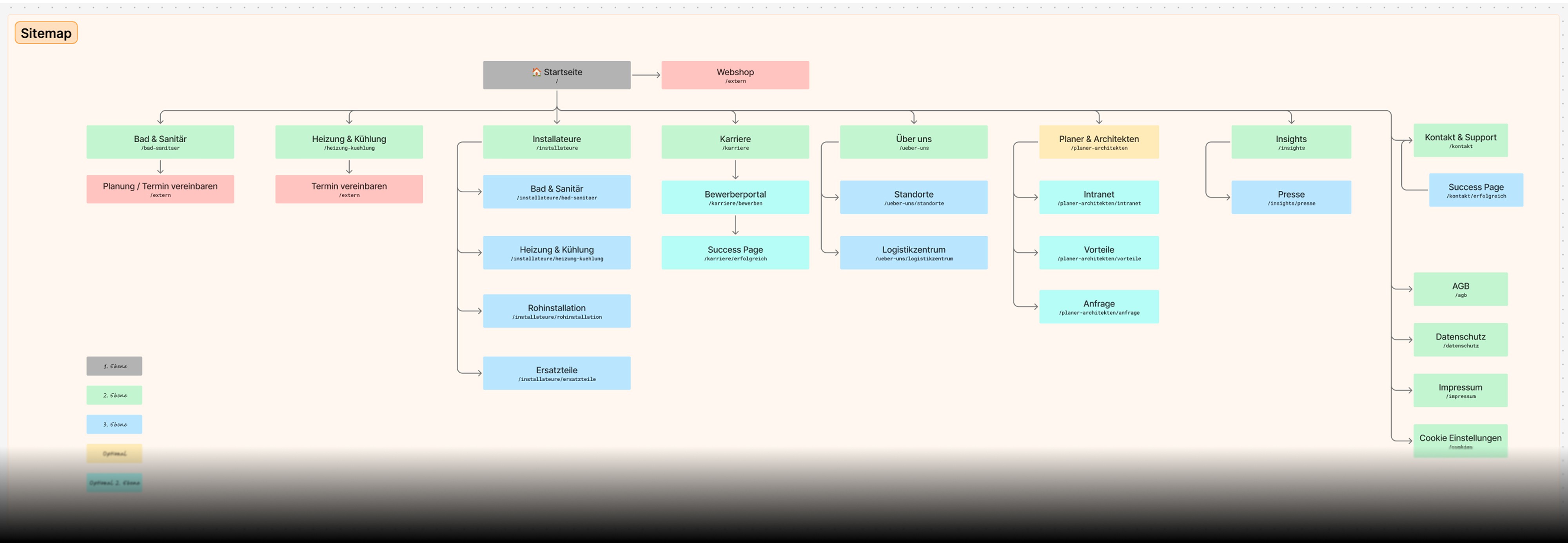
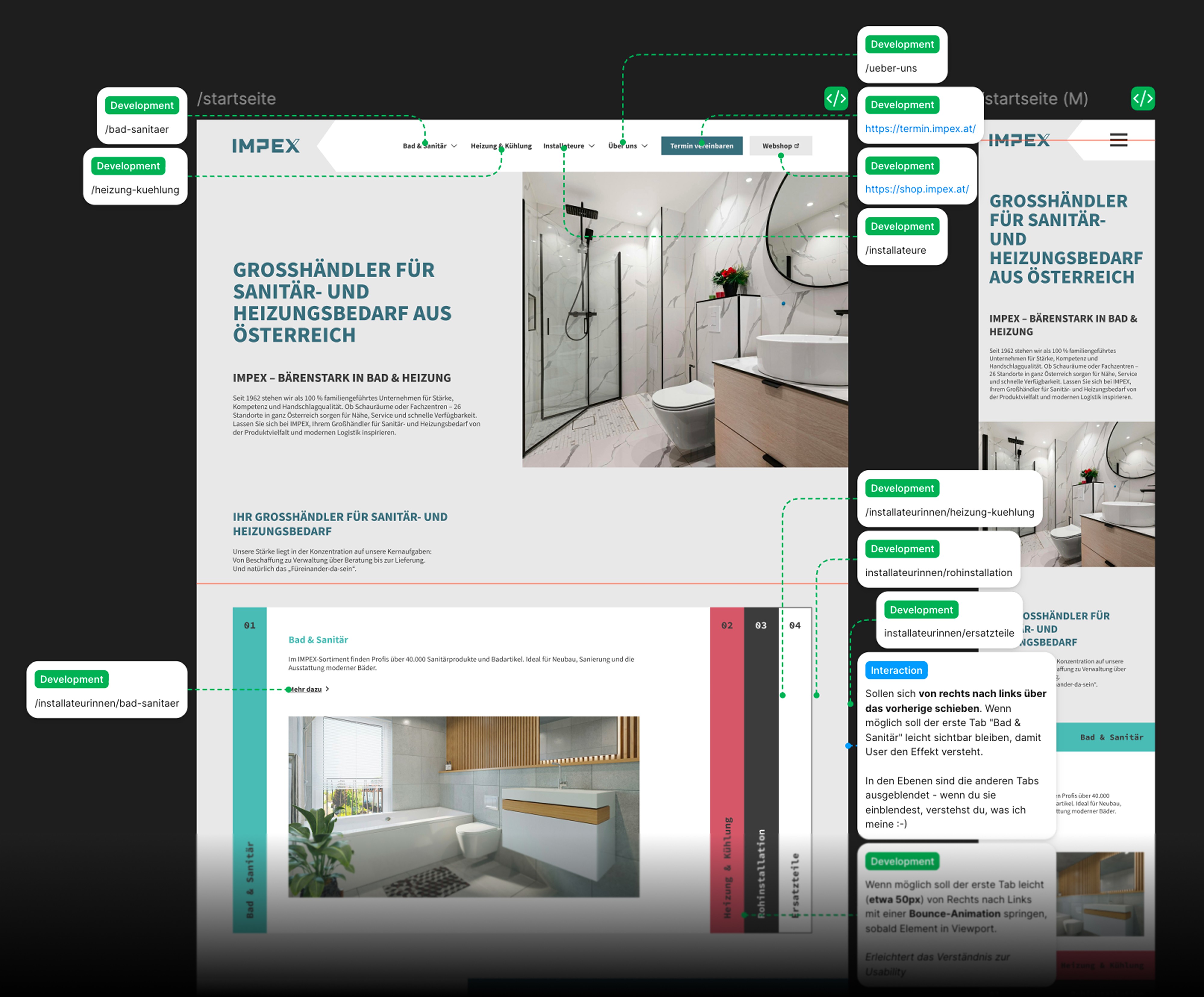
/// From there, I developed the full information architecture: sitemap, URL structure, and page hierarchy across all sections. All UI work was executed in Figma, covering a complete design system, responsive screen layouts, and detailed developer annotations for a clean handoff to the development team. Accessibility was treated as a core requirement throughout — not an afterthought.

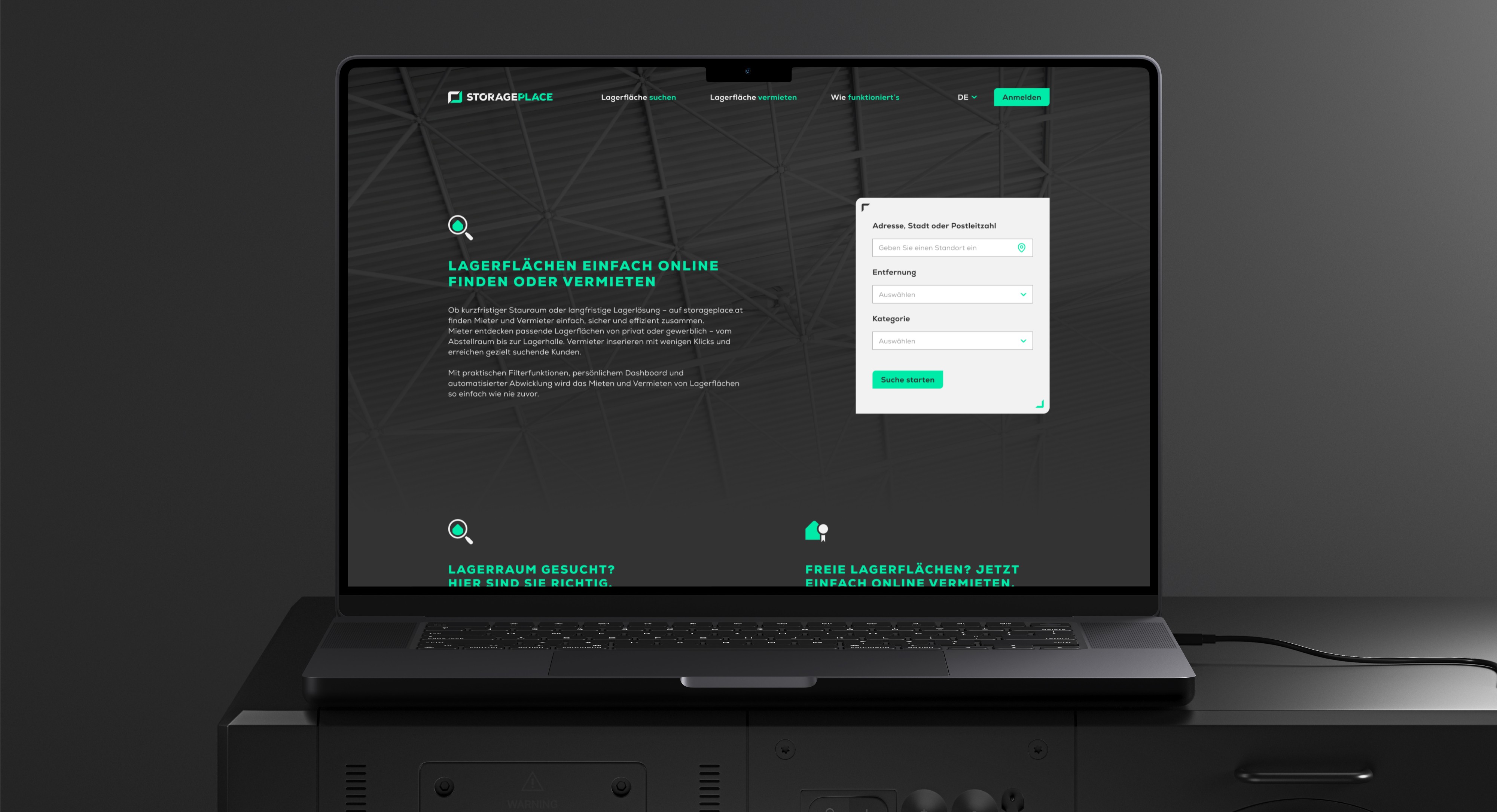
STORAGEPLACE
///UX UI CONCEPT Two-sided marketplace for storage spaces — designed for renters and landlords simultaneously, from research to developer handoff.
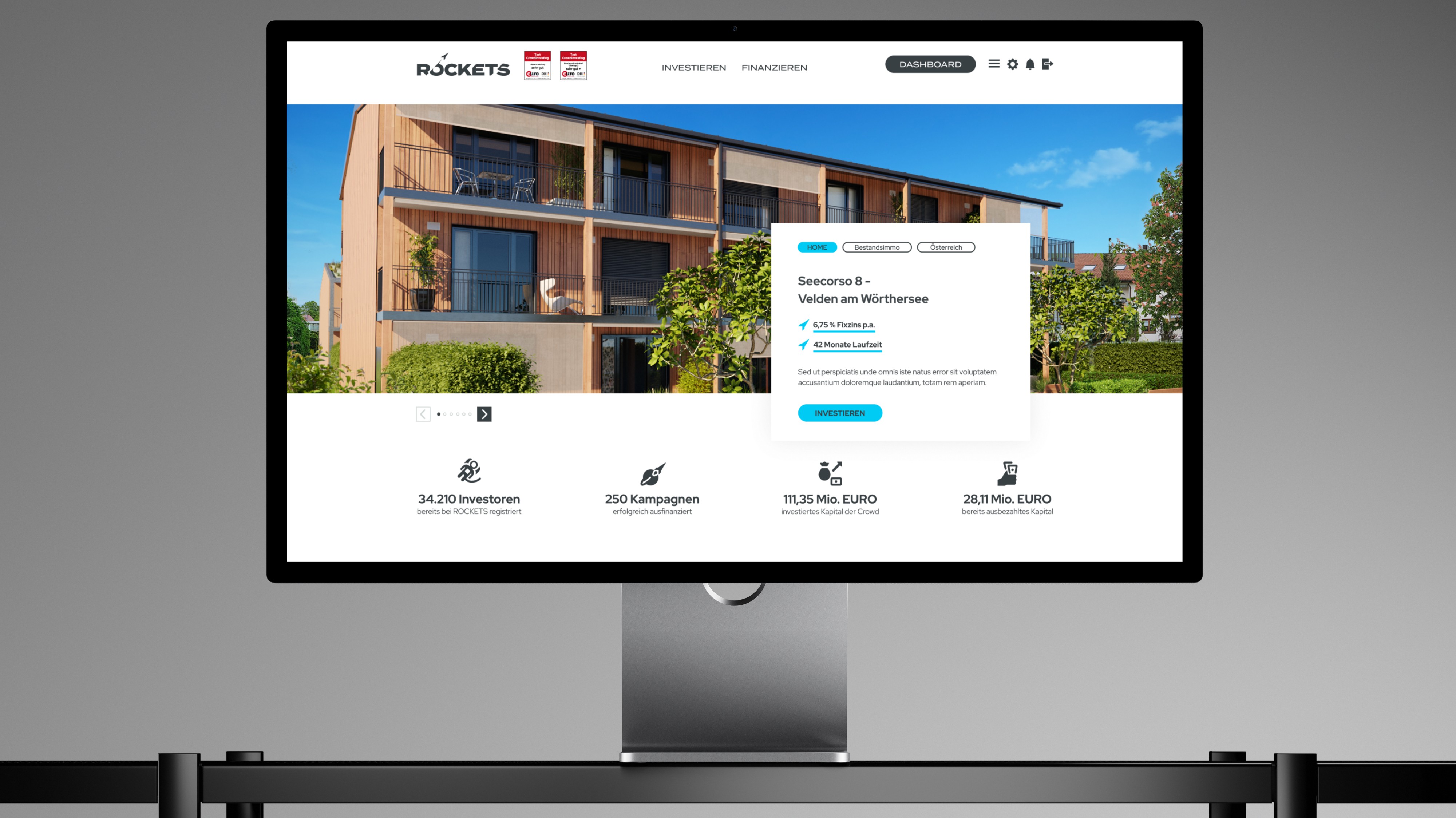
ROCKETS Investments
///UX UI CONCEPT Merging three crowdinvesting brands into one unified platform — without losing trust, identity, or a single existing user along the way.