EXIAS Medical Website
How do you build a website for a medical technology company that needs to speak to two completely different audiences at once — a clinical lab director evaluating precision instruments, and an international distributor looking for a reliable business partner? That was the challenge behind the EXIAS Medical redesign: one website, one strong brand, and no room for ambiguity.

/// EXIAS Medical is an Austrian manufacturer of high-precision electrolyte analysers, serving human medicine, veterinary diagnostics, and research institutions worldwide. The website needed to reflect that level of precision — positioning EXIAS as a credible, innovation-driven global player while serving both technical end users and international distribution partners through a single, coherent digital presence. A gated Distributor Area was built in as a dedicated layer on top of the public-facing site.
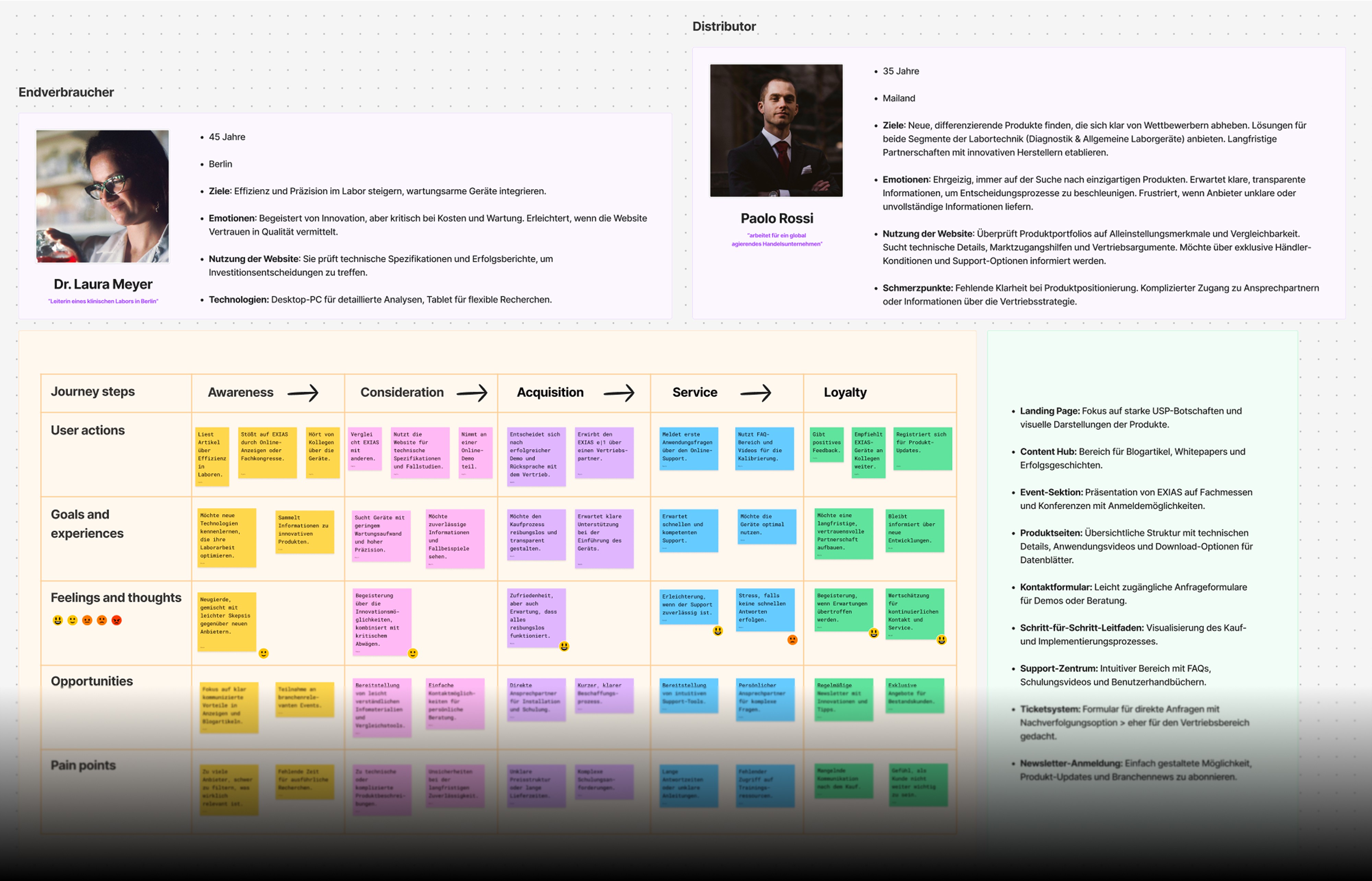
/// EXIAS operates in a highly specialised market where trust and technical credibility are everything. The existing digital presence didn't reflect the quality of the product or the ambition of the brand. Beyond that, the site had to serve two fundamentally different user types — Dr. Laura Meyer, a lab director who scrutinises technical specs and case studies before making an investment decision, and Paolo Rossi, an international distributor who needs clear positioning, sales support, and a direct line to the team. Designing for both, without compromising either, was the central UX challenge.

/// A dual-audience website with clearly defined entry points for end users and distributors alike — supported by a persona-driven information architecture, a gated Distributor Area with its own login and account dashboard, and product pages built to communicate technical depth without overwhelming non-specialist visitors.
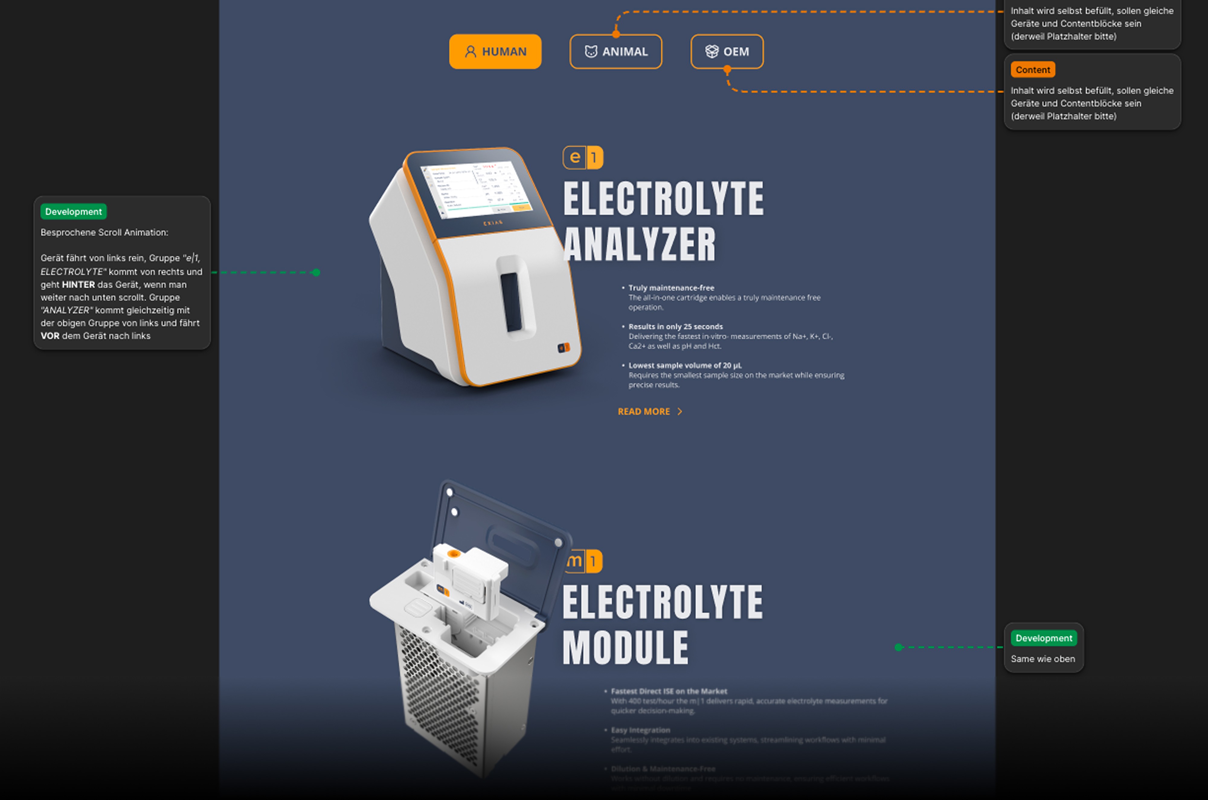
/// The design system leans into EXIAS's bold brand identity — dark navy, high-contrast orange, and clean typographic hierarchy — projecting the precision and confidence the brand needed to own in its market.
+51%
Distributor Enquiry Rate
+35%
Product Page Engagement
+44%
Avg. Session Duration


/// The project started with two detailed user personas — a clinical end user and a global distributor — each mapped through a full journey from Awareness to Loyalty, with pain points, goals, and optimization opportunities defined at every stage. This research directly shaped the sitemap, content hierarchy, and page-level UX decisions across the entire site.
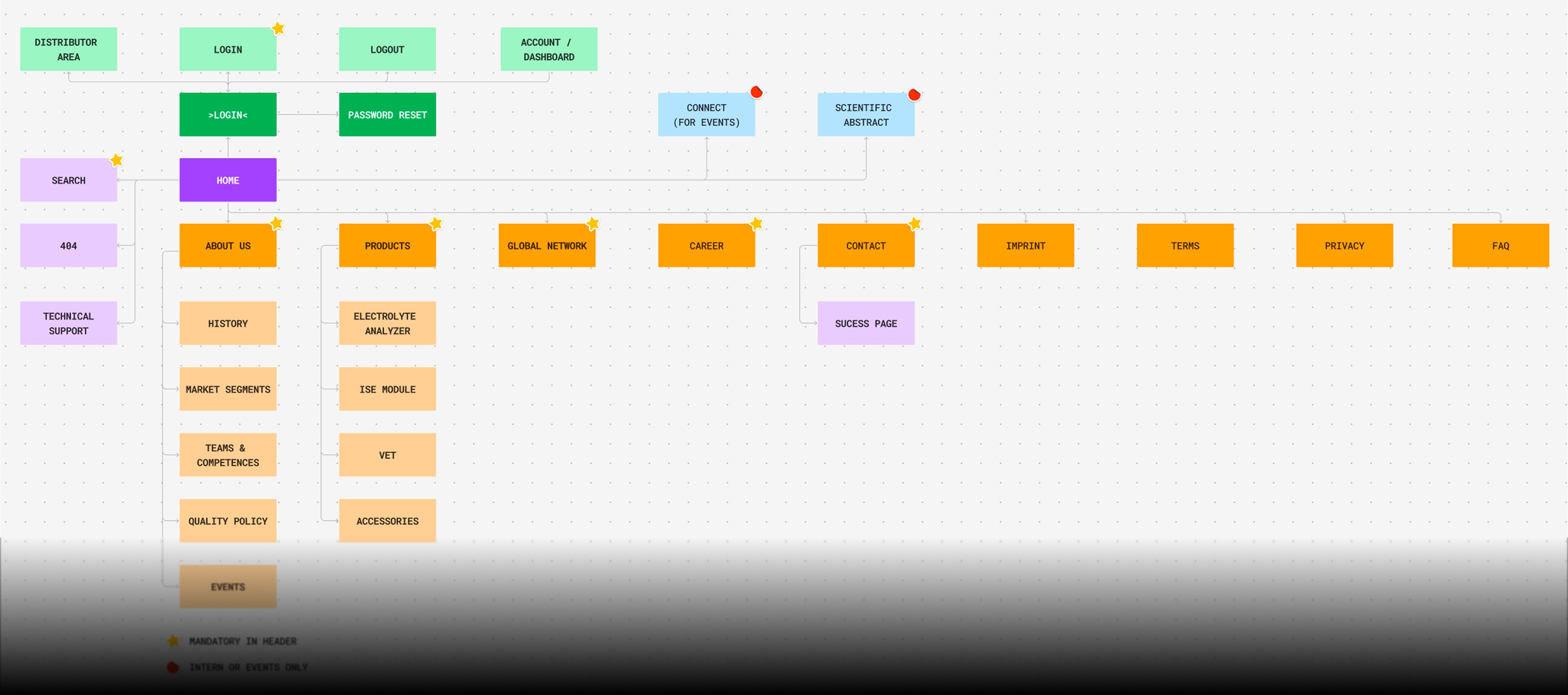
/// All UI work was delivered in Figma: a complete design system, responsive screen layouts for all pages — Home, About Us, Products, Global Network, Career, Contact, and the Distributor Area — including detailed developer annotations for a clean handoff. The product section alone covered four distinct product lines, each requiring its own page structure balancing technical specifications, application videos, and distributor CTAs.

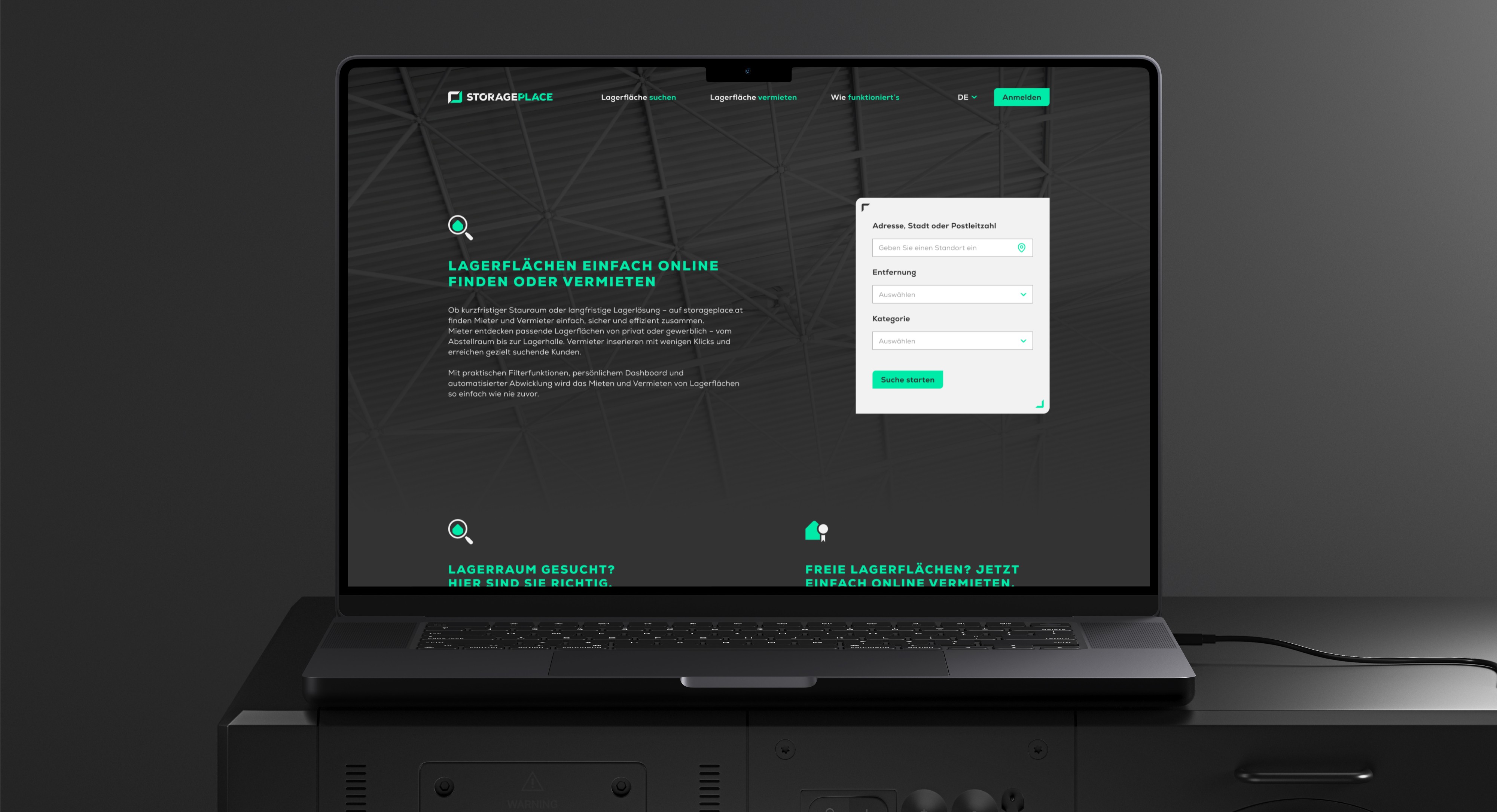
STORAGEPLACE
///UX UI CONCEPT Two-sided marketplace for storage spaces — designed for renters and landlords simultaneously, from research to developer handoff.
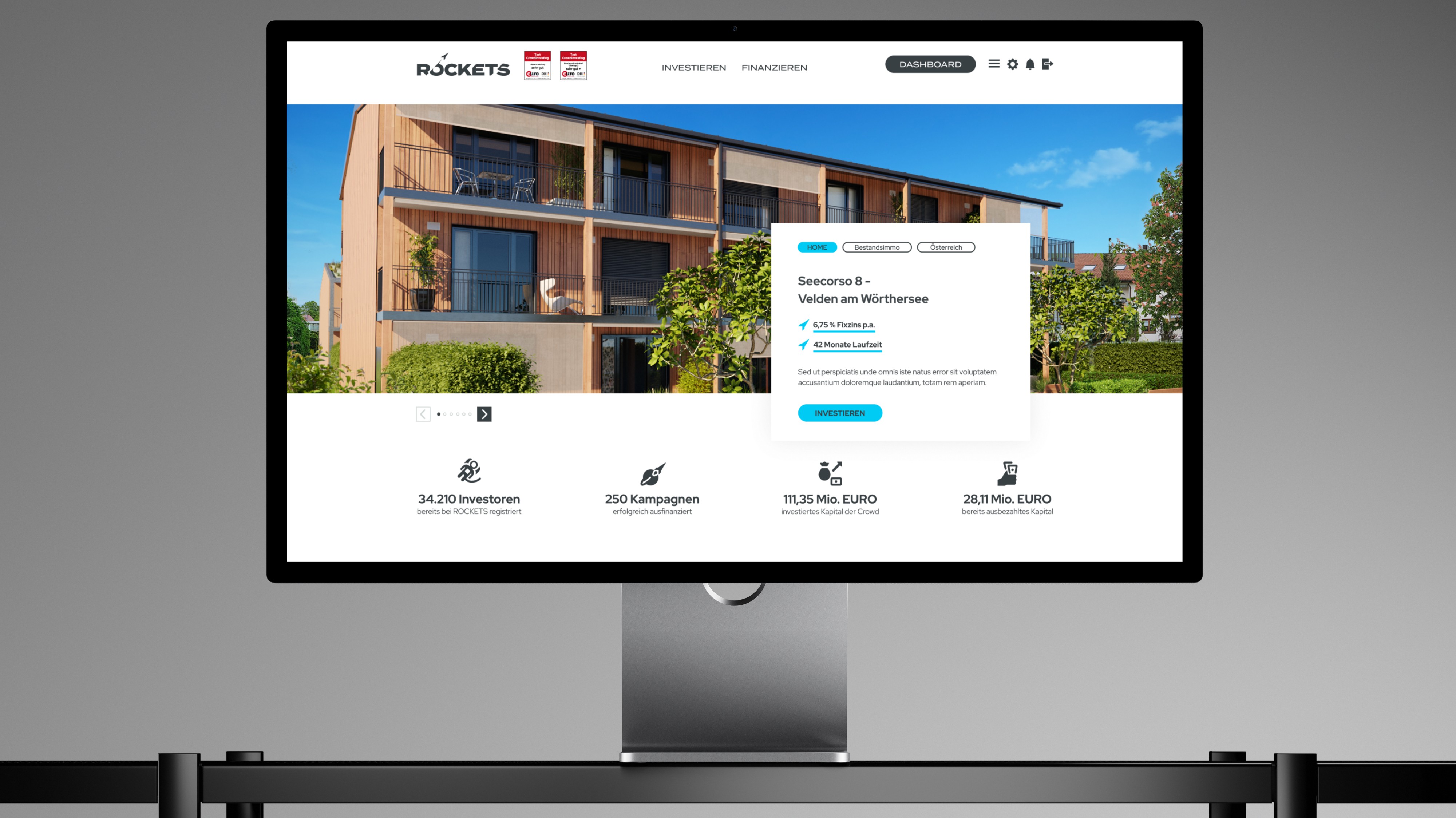
ROCKETS Investments
///UX UI CONCEPT Merging three crowdinvesting brands into one unified platform — without losing trust, identity, or a single existing user along the way.